
- cross-posted to:
- [email protected]
- cross-posted to:
- [email protected]
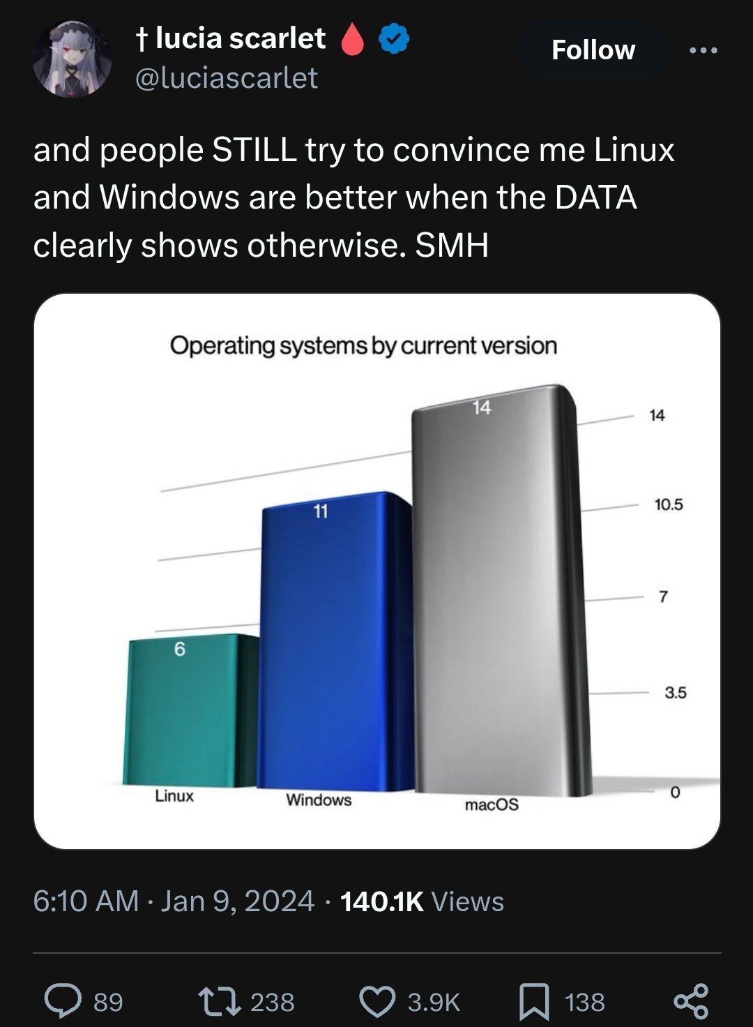
Image shows a tweet with the header “and people STILL try to convince me Linux and Windows are better when the DATA clearly shows otherwise. SMH” with an image attached showing the following:
“Operating systems by current version” Mac OS: 14 Windows: 11 Linux: 6
When used correctly the point of the graph is to make use of the fact that humans are super fast at visual convolution tasks but not so great at doing mental statistics. If your graph makes the interpretation of complicated statistical facts immediate for the viewer (and as faithful to the facts as possible, whatever that means) then it has achieved its purpose.
I get that, I know what a graph is, but this is clearly meant as a meme, hence the lacking axis descriptions and scale, and the 3d rendering. It’s literally just a meme
hmm I thought it was a meme built on top of a real graph