
- cross-posted to:
- [email protected]
- cross-posted to:
- [email protected]
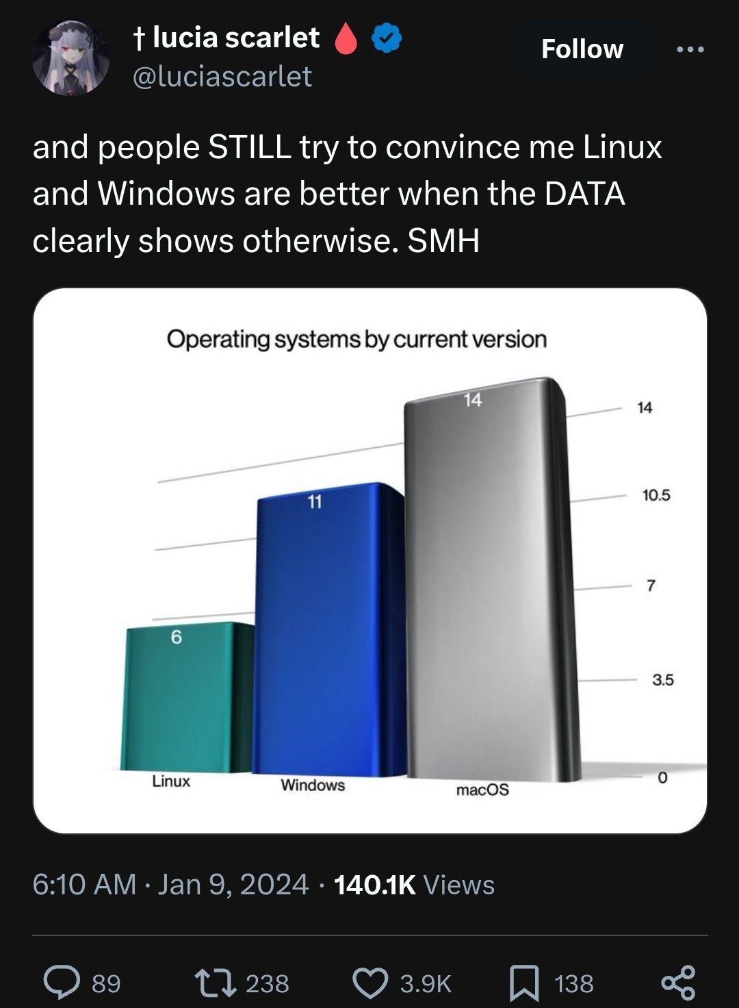
Image shows a tweet with the header “and people STILL try to convince me Linux and Windows are better when the DATA clearly shows otherwise. SMH” with an image attached showing the following:
“Operating systems by current version” Mac OS: 14 Windows: 11 Linux: 6
I get that, I know what a graph is, but this is clearly meant as a meme, hence the lacking axis descriptions and scale, and the 3d rendering. It’s literally just a meme
hmm I thought it was a meme built on top of a real graph